
업데이트:
Grid 속성
Grid 컨텐이너 정의
그리드는 블럭 그리드(Block Grid)와 인라인 그리드(Inline Grid)로 나뉘며, display속성으로 정의한다.
.Container {
  display:grid; /* 블럭 그리드 */
  display:inline-grid; /* 인라인 그리드 */
 }
* 그리드가 정의된 컨테이너는 부모로 보고 포함된 요소는 그리드 아이템이 되는데, 부모는 overflow 속성을 정의할 수 있지만 그리드 아이템에는 float, clear, vertical-align, ::first-letter, ::first-line 이 적용되지 않는다.
Grid 행/열 정의
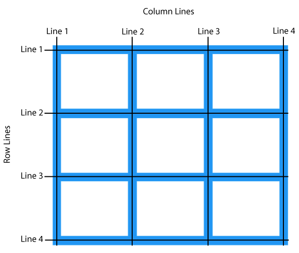
Grid의 라인과 라인 사이 즉, 공백영역을 트랙(track)이라고 표현한다. 아래 정의된 속성은 트랙의 사이즈를 정의하는 속성이다.
트랙의 사이즈 단위는 px, rem, em, %, fr, ch, vw, vh 등으로 정의할 수 있다.
grid-template-columns 예제
grid-template-columns:50px 1fr auto 30px 100px; /* 열 정의 */
grid-template-rows 예제
grid-template-rows:20px 30px 40px 50px 1fr; /* 행 정의 */
grid-template-* : repeat(갯수, 너비) 예제
grid-template-columns:repeat(5, 70px) /* 값이같은 3개의 열을 한번에 정의 */
grid-template 단축형 사용
grid-template:50px 1fr auto 30px 100px / 20px 30px 40px 50px 1fr;
grid-template:repeat(3, 200px) / repeat(2, 50%); /* rows, columns 순으로 지정 */
grid-template-* : minmax(최소값, 최대값) 사용
minmax()를 이용하면 그리드 아이템의 크기를 최소값과 최대값 사이에서 자동으로 조절한다.
grid-template-columns:100px minmax(200px, 500px) 1fr;
grid-template-columns:repeat(2, minmax(100px, 500px)) 1fr;
min-content, max-content 사용
min-content는 내부 컨텐츠에 가장 긴 단어의 너비의 길이를 갖는다. 반면 max-content는 white-space:nowrap과 같은 효과로 가장 긴 문장의 너비 만큼 너비를 갖는다.
grid-template-columns:min-content 100px 1fr;
grid-template-columns:max-content 50px 1fr;
Grid 여백정의
앞에 grid- 키워드를 생략할 수 있다.
grid-row-gap: 50px; /* 행 사이 여백 정의 */
grid-column-gap: 50px; /* 열 사이 여백 정의 */
grid-gap:50px 10px; /* 행 열 순서로 한번에 정의 */
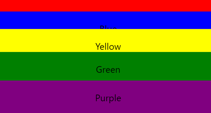
grid-template-columns + grid-gap 예제
display:grid;
grid-template-columns:100px 1fr;
grid-gap:10px 20px;
Grid 영역
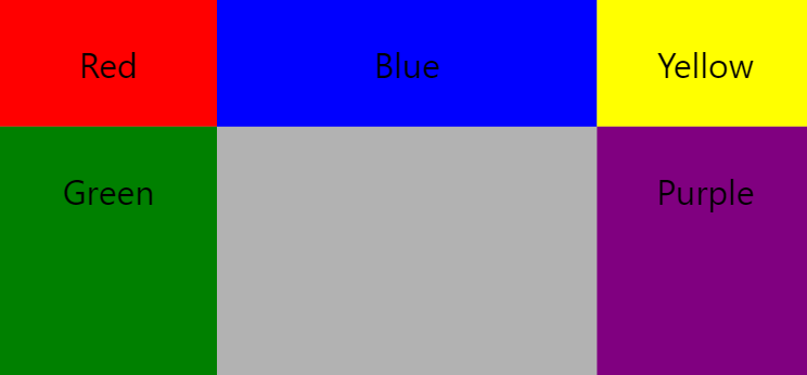
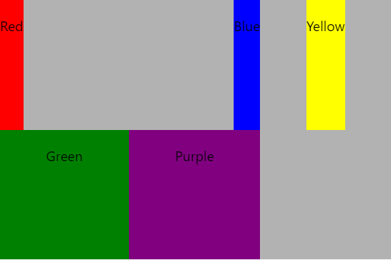
grid-template-areas를 이용하여 요소를 영역에 배치할 수 있다.
grid-area를 이용하여 그리드 아이템에 별칭을 선언하고, 부모영역에서 이것을 참조하여 위치와 배치를 할 수 있다. 같은 별칭을 연속적으로 배치할 경우 병합을 의미한다.
* 테스트하면서 grid-area에 ‘purp’형식으로 정의할 경우 적용이 되지 않았다.
grid-template-areas 예제
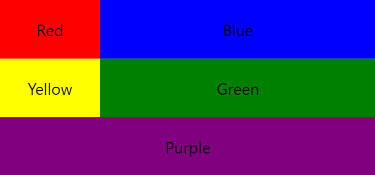
.container {
display:grid;
grid-template-columns:100px 1fr;
grid-template-rows:repeat(3, 1fr);
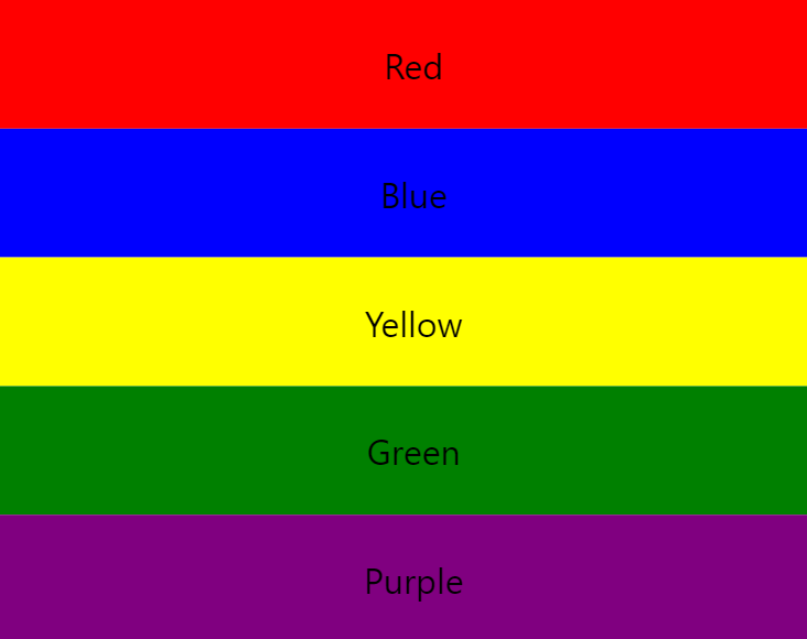
grid-template-areas:"rd blu" "ylw grn" "purp purp";
background-color:rgba(0,0,0,0.3);
}
.bg-red {grid-area:rd;}
.bg-blue {grid-area:blu;}
.bg-yellow {grid-area:ylw;}
.bg-green {grid-area:grn;}
.bg-purple {grid-area:purp;}
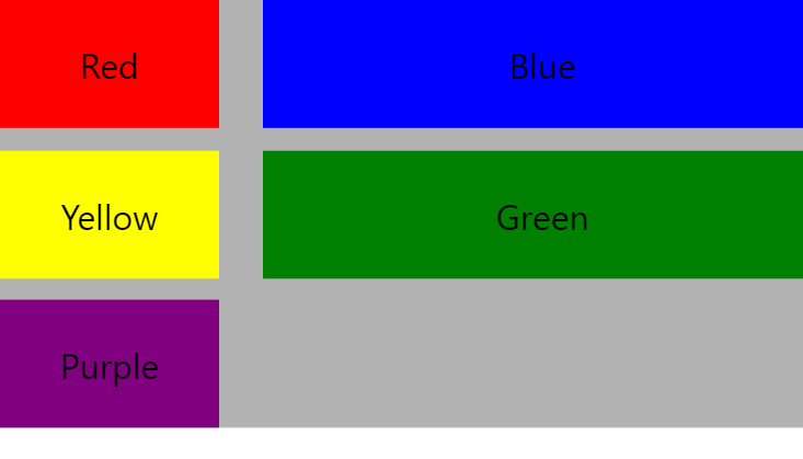
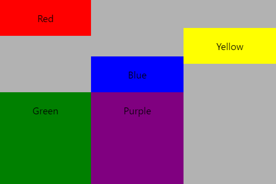
.을 중간에 사용할 경우 해당 영역을 비움으로 처리한다.
.container {
display:grid;
grid-template-columns:100px 1fr;
grid-template-rows:repeat(3, 1fr);
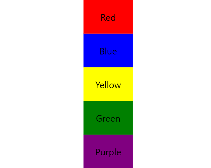
grid-template-areas:"rd blu ylw" "grn . purp" "grn . purp";
background-color:rgba(0,0,0,0.3);
}
.bg-red {grid-area:rd;}
.bg-blue {grid-area:blu;}
.bg-yellow {grid-area:ylw;}
.bg-green {grid-area:grn;}
.bg-purple {grid-area:purp;}
그리드 아이템으로 배치하기 예제
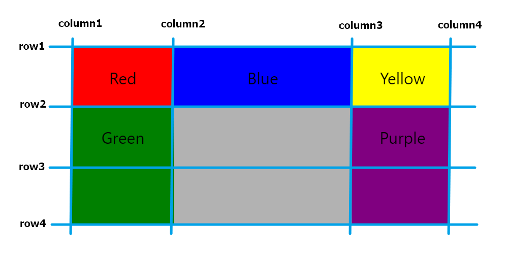
grid-column grid-row는 그리드의 라인의 순서 번호를 지정하여 배치할 영역을 지정한다. 하나의 요소를 병합시키기위해 grid-column-start, grid-column-end같이 범위를 지정하면 된다. grid-row도 같은 방식으로 정의할 수 있다.
.container {
  display:grid;
  grid-template-columns:100px 1fr 100px;
  grid-template-rows:repeat(3, 1fr);
  background-color:rgba(0,0,0,0.3);
}

.bg-red {grid-column:1;}
.bg-blue {grid-column:2; grid-row:1;}
.bg-yellow {grid-column:3; grid-row:1;}
.bg-green {grid-column:1;grid-row-start:2;grid-row-end:4;}
.bg-purple {grid-column:3;grid-row-start:2;grid-row-end:4;}
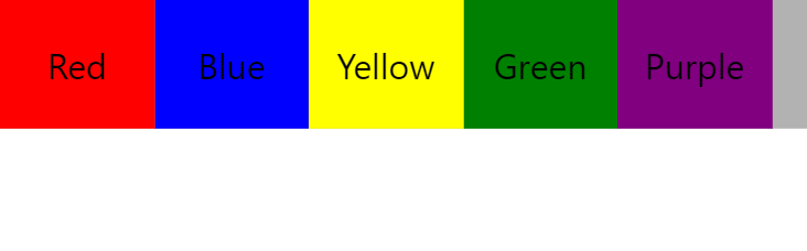
순서 정의
그리드 아이템은 기본적으로 order:0 이라는 값을 가지고 있다. z-index처럼 배치의 우선 순위를 지정하여 순서를 변경할 수 있다.
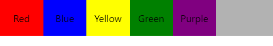
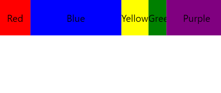
HTML에 정의된 순서대로 너비 70px를 갖은 요소 5개가 배치되어있다. 여기에서의 순서는 red blue yellow green purple 순 이다. order를 이용해서 순서를 바꿔보자!!
order 정의
.container {
  display:grid;
  grid-template-columns:70px 70px 70px 70px 70px;
  background-color:rgba(0,0,0,0.3);
}
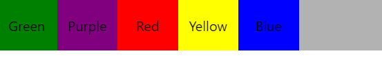
red에는 order:1을 blue에는 order:3을 yellow에는 order:2를 각각 지정해 주었다. 여기에서 order는 배치의 순서를 지정하는 위치값이 아닌 우선 순위라는 것을 기억해야 한다.
green과 purple은 기본값인 order:0이기 때문에 맨앞에 배치되어 있고 red(1) yellow(2) blue(3) 순서대로 배치된 것을 확인할 수 있다.
.container {
  display:grid;
  grid-template-columns:70px 70px 70px 70px 70px;
  background-color:rgba(0,0,0,0.3);
}

.bg-red {order:1;}
.bg-blue {order:3;}
.bg-yellow {order:2;}
.bg-green {}
.bg-purple {}
Grid 정렬
justify-content
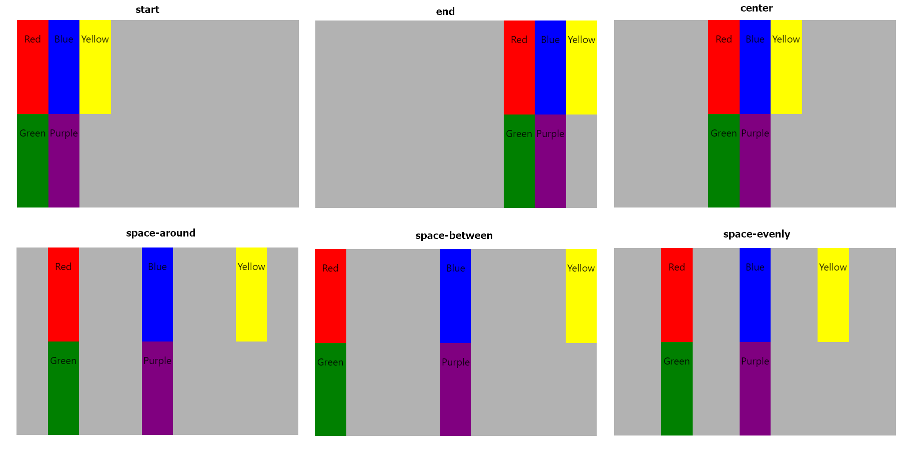
그리드 아이템(자식요소)이 그리드 컨테이너(부모)보다 너비가 작을 경우 수평정렬을 해주는 속성이다. value로는 start, center, end, stretch, space-around, space-between, space-evenly의 6개의 값을 갖는다.
.container {
  display:grid;
  height:300px;
  grid-template-columns: 50px 50px 50px;
  justify-content: start; //center, end, stretch, space-around, space-between, space-evenly
  background-color:rgba(0,0,0,0.3);
}
align-content
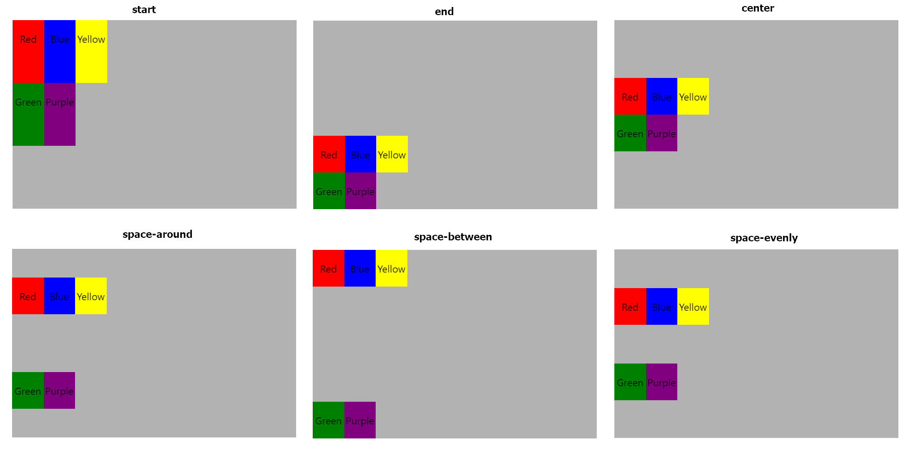
그리드 아이템(자식요소)이 그리드 컨테이너(부모)보다 너비가 작을 경우 수직정렬을 해주는 속성이다. value로는 start, center, end, stretch, space-around, space-between, space-evenly의 6개의 값을 갖는다.
.container {
  display:grid;
  height:300px;
  grid-template-columns: 50px 50px 50px;
  align-content: start; //center, end, stretch, space-around, space-between, space-evenly
  background-color:rgba(0,0,0,0.3);
}
justify-items
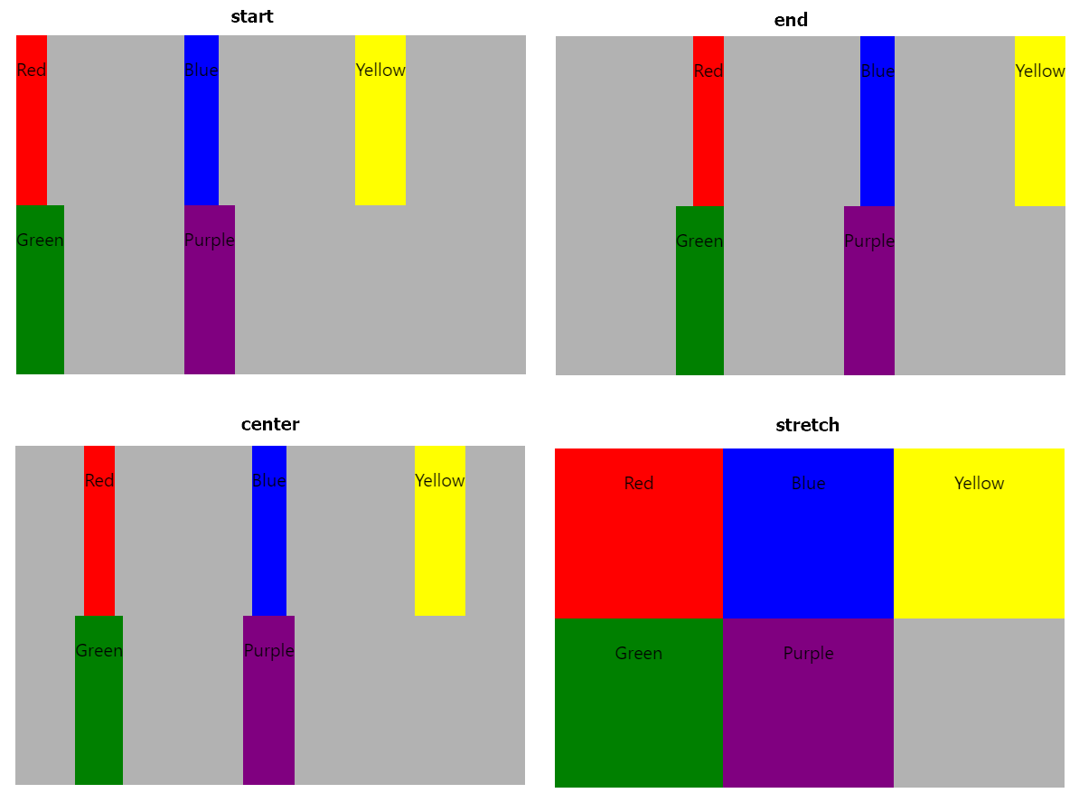
그리드 아이템의 내부 컨텐츠의 영역은 기본값으로 strech값을 갖고 있어 너비가 꽉 채워진 상태이다. 이 속성을 다른 값으로 변경할 경우 아이템의 수평 영역은 컨텐츠 만큼 채우고 수평 정렬을 한다. value로는 start, center, end, stretch의 4개의 값을 갖는다.
.container {
  display:grid;
  height:300px;
  grid-template-columns: 50px 50px 50px;
  justify-items: start; //center, end, strecth
  background-color:rgba(0,0,0,0.3);
}
align-items
그리드 아이템의 내부 컨텐츠의 영역은 기본값으로 strech값을 갖고 있어 너비가 꽉 채워진 상태이다. 이 속성을 다른 값으로 변경할 경우 아이템의 수직 영역은 컨텐츠 만큼 채우고 수직 정렬을 한다. value로는 start, center, end, stretch의 4개의 값을 갖는다.
.container {
  display:grid;
  height:300px;
  grid-template-columns: 50px 50px 50px;
  align-items: start; //center, end, strecth
  background-color:rgba(0,0,0,0.3);
}
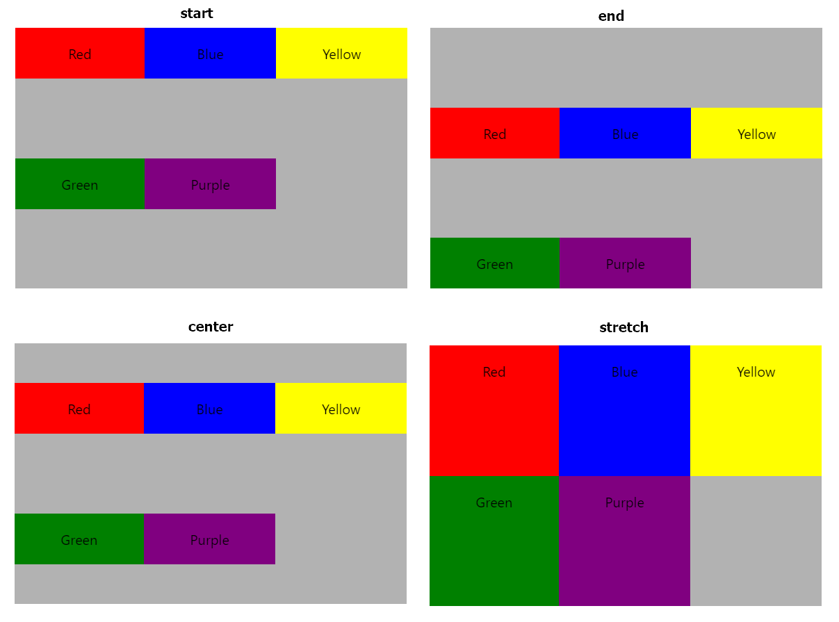
justify-self
그리드 아이템의 내부 컨텐츠를 수평정렬하는 속성으로, justify-items, align-items와 달리 그리드 아이템에 개별적으로 적용하는 속성이다.
value로는 start, center, end, stretch의 4개의 값을 갖는다.
.container {
  display:grid;
  height:300px;
  grid-template-columns: 50px 50px 50px;
  background-color:rgba(0,0,0,0.3);
}
.bg-red {justify-self:start;}
.bg-blue {justify-self:end;}
.bg-yellow {justify-self:center;}
.bg-green {justify-self:stretch;}
.bg-purple {} //적용하지 않을 경우 기본값 stretch가 적용됨.
align-self
그리드 아이템의 내부 컨텐츠를 수직정렬하는 속성으로, justify-items, align-items와 달리 그리드 아이템에 개별적으로 적용하는 속성이다.
value로는 start, center, end, stretch의 4개의 값을 갖는다.
.container {
  display:grid;
  height:300px;
  grid-template-columns: 50px 50px 50px;
  background-color:rgba(0,0,0,0.3);
}
.bg-red {align-self:start;}
.bg-blue {align-self:end;}
.bg-yellow {align-self:center;}
.bg-green {align-self:stretch;}
.bg-purple {} //적용하지 않을 경우 기본값 stretch가 적용됨.
댓글남기기